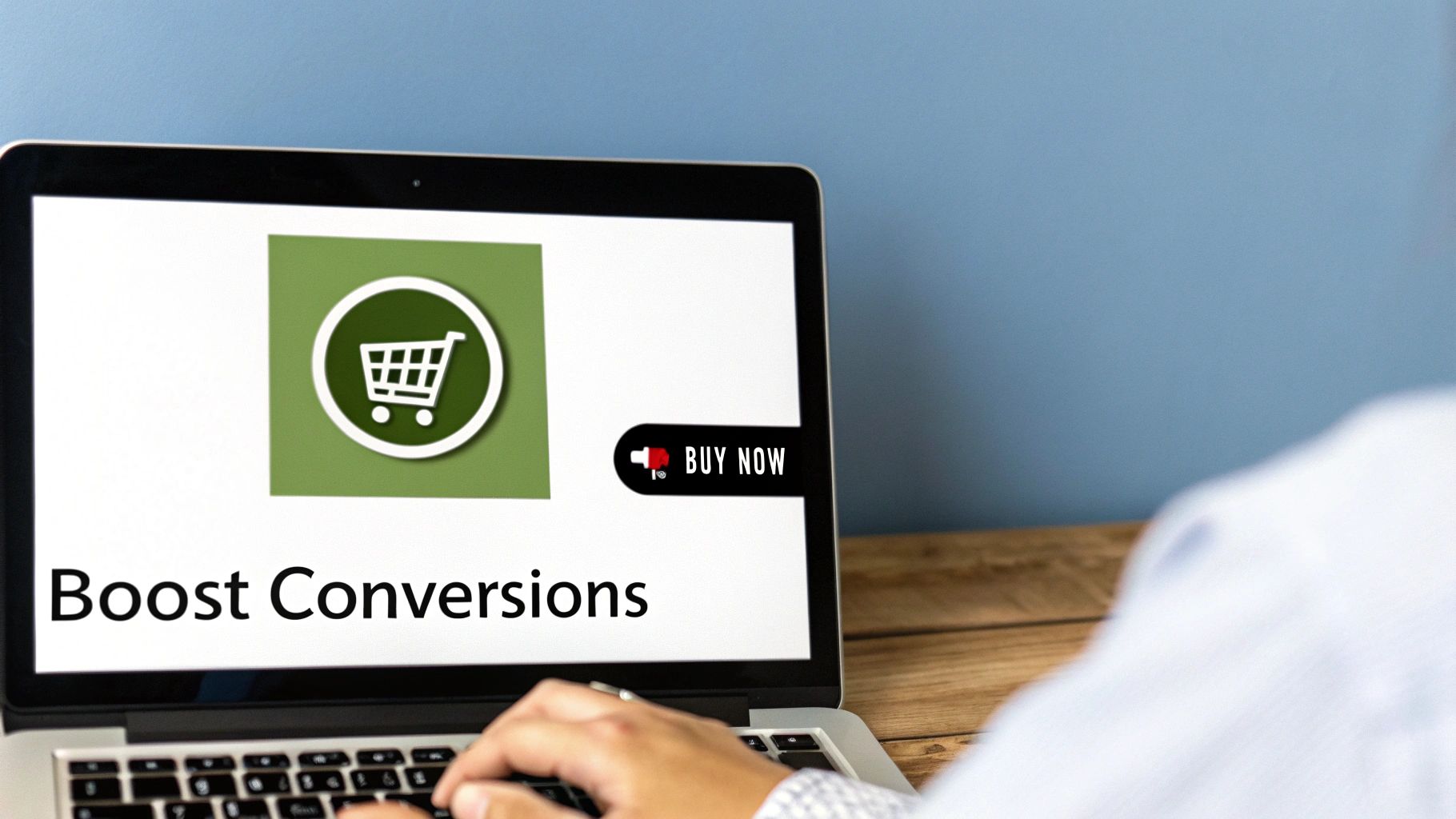
Thinking about adding a one-page checkout to your WooCommerce store? That's a great idea. It’s one of the most effective ways to simplify the buying process, letting your customers select their products and pay, all on a single, easy-to-navigate page. Making this change can seriously reduce abandoned carts and encourage customers to return.
Why a Simpler Checkout Is a Game-Changer
Let's be honest, there's nothing more frustrating than watching a customer fill their cart, only to disappear right before hitting the 'pay' button. We've all been there, wondering where we went wrong. More often than not, the culprit is a clunky, long-winded checkout process.
Put yourself in your customer’s shoes for a moment. They’ve found something they love on your site and are ready to buy, but then they hit a wall. They’re forced to click through page after page, fill out form after form, and wait for each new screen to load. It can feel like queuing up multiple times just to make one payment. It’s no wonder so many people simply give up.
It’s All About Simplicity
A streamlined checkout isn't just about speed; it's about making things feel effortless. Every extra step or click is another chance for a customer to have second thoughts or get distracted. A one-page checkout setup simply removes that friction.
When you present all the necessary fields—from billing details to payment options—on a single, well-organised page, you give the customer a sense of control and transparency. They can see the entire process at a glance, which builds their confidence and reduces the mental effort needed to complete the purchase.
A seamless checkout experience shows you respect your customer's time. When you make it easy for them to buy, you're not just improving conversions; you're building a positive relationship that encourages them to return.
The table below gives you a quick, at-a-glance comparison of the user experience and business impact between a traditional multi-step checkout and a modern one-page checkout.
Traditional Checkout vs One-Page Checkout
| Feature | Traditional Multi-Step Checkout | One-Page Checkout |
|---|---|---|
| User Journey | Multiple pages for shipping, billing, payment. | All fields on a single, scrollable page. |
| Perceived Effort | High. Can feel tedious and time-consuming. | Low. Feels quick and straightforward. |
| Distraction Points | Many. Each page load is a chance to leave. | Minimal. The entire process is visible upfront. |
| Mobile Experience | Often clunky and difficult to navigate. | Typically responsive and much easier on smaller screens. |
| Conversion Impact | Higher abandonment rates are common. | Generally leads to higher conversion rates. |
As you can see, the benefits of a one-page system extend beyond just aesthetics; they directly address the core reasons why customers abandon their carts.
The Real Cost of a Complicated Process
The numbers really tell the story. Studies consistently show that lengthy, multi-step checkouts can cause abandonment rates as high as 70% in UK e-commerce. A huge part of this is the friction from multiple clicks and page loads—a problem amplified in the UK, where around 63% of all online shopping now happens on mobile phones.
For UK-based stores, making the switch to a one-page checkout woocommerce plugin has been shown to boost conversion rates by up to 20% and slash cart abandonment by 15-25%. It's a significant improvement.
This isn’t just about lost sales, either. A clunky checkout can damage your brand's reputation and drag down your site's performance metrics.
Key Benefits You'll See
Adopting a one-page system brings several clear advantages to your store:
- Reduced Cart Abandonment: This is the big one. By simplifying the journey, you give customers far fewer reasons to bail before paying.
- A Better User Experience: A faster, more intuitive process leaves a great impression, particularly for the majority of shoppers on mobile.
- Faster Loading Times: Fewer pages to load means a quicker path from adding to the cart to seeing that confirmation message. Site speed is critical and has a direct impact on sales. If you're curious about your own site, our guide on website performance monitoring tools can help.
- Higher Conversion Rates: A smoother experience naturally translates into more completed purchases, which directly boosts your bottom line.
Ultimately, simplifying your checkout is one of the highest-impact changes you can make. It tackles the final, most critical step in the customer's journey, turning more of your browsers into buyers.
How to Choose the Right Checkout Plugin
Walking into the world of WordPress plugins can feel a bit like stepping into a massive, overwhelming library. Every plugin promises to be the one, especially for something as critical as your checkout process. It’s easy to get lost in the options.
The secret? Stop searching for the single "best" one-page checkout woocommerce plugin. Instead, let's focus on finding the one that’s right for your business. I'll walk you through a simple framework I use to help clients make this decision, focusing on what really matters: your specific needs, your technical comfort level, and what your customers actually expect.
Defining Your Core Needs
Before you even glance at a plugin, pause and think about your shop. Are you selling a handful of bespoke items? Or is your catalogue packed with hundreds of products? Do your customers usually buy one thing at a time, or do they build large, complex orders?
Answering these simple questions is the first step to identifying your ideal setup. For instance, a store selling a single digital download has completely different requirements from a wholesaler who needs customers to select multiple product variations and quantities.
Let's break down a couple of common scenarios I see all the time:
- For pure simplicity: If you have just a few products and most sales are for a single item, a pop-up checkout is brilliant. The customer adds an item to their cart, and a sleek checkout window instantly appears. It’s fast, modern, and keeps the user focused.
- For larger catalogues: If you sell lots of different items and expect customers to browse and add multiple products, displaying the checkout form below a product table is often far more practical. This lets people add items, see their list grow, and then scroll down to pay—all on the same page.
The Non-Negotiable Feature Checklist
No matter which style you lean towards, some features are simply essential. I call this my quality-control checklist. Any plugin you seriously consider should tick every one of these boxes.
- Seamless Mobile Performance: With over 60% of UK online shopping now happening on phones, your checkout must be flawless on a small screen. Don't just trust the marketing spiel; test the plugin's demo on your own mobile. Is it easy to type into the fields? Are the buttons big enough to tap without fumbling?
- Payment Gateway Support: This one’s a deal-breaker. You need to ensure the plugin works perfectly with your chosen payment providers, whether that’s Stripe, PayPal, or another gateway. A plugin is completely useless if it doesn't support the way you get paid.
- Reliable Developer Support: Have a look at the plugin's reviews, check how recently it was updated, and scan the support forums. A well-supported plugin from a reputable developer means you’ll get help when you need it and regular updates to keep everything secure and working smoothly.
- Customisation Options: You’ll almost certainly want to tweak the checkout to match your brand's look and feel. This means having the ability to change colours, button text, and field layouts without needing to dive into code.
A great plugin doesn't just add a feature; it enhances the entire customer experience. It should feel like a natural, integrated part of your website, not a clunky add-on.
Understanding the Trade-Offs
It’s important to realise that there's no perfect, one-size-fits-all solution. You're always dealing with a series of trade-offs. Some plugins are incredibly powerful but come with a much steeper learning curve. Others are dead simple to use but might lack advanced features for more complex stores.
For example, a plugin like WooCommerce Fast Cart is exceptional at creating that quick pop-up checkout experience. It’s fantastic for stores laser-focused on speed and single-item purchases.
On the other hand, combining a plugin like WooCommerce Product Table with the official WooCommerce One Page Checkout extension gives you a hugely powerful order form. This setup is ideal for restaurants, wholesalers, or any business where customers build a large order from a list. It’s more involved to configure but offers tremendous flexibility.
Choosing the right plugin is really about matching the tool to the task. By first understanding what your customers need and what your non-negotiable features are, you can approach the options with clarity and confidence. This way, you’re not just picking a plugin—you’re making a strategic decision to improve your business.
Getting Your One-Page Checkout Set Up
Right, you’ve picked your plugin and you're ready to get this one-page checkout built. This is where the magic happens and your ideas start taking shape. Don't feel intimidated if some of this seems a bit technical; I'm going to walk you through it, piece by piece.
Before you even think about touching a single setting, there's one unbreakable rule: always back up your site first. It's the digital equivalent of putting on your seatbelt—a quick, simple precaution that gives you total peace of mind. If anything goes sideways, you can restore your site in a flash. For bonus points, do all this on a staging site. It’s a private copy of your live store where you can experiment without any risk.
Getting the Plugin Installed and Activated
First things first, let's get that plugin installed. The good news is this part is as straightforward as it gets, just like adding any other WordPress plugin.
Head to your WordPress dashboard and navigate to Plugins > Add New. From here, you can either upload the plugin’s .zip file (if you went with a premium option) or search for it by name if it's a free one from the WordPress repository. Just click ‘Install Now,’ then ‘Activate.’ Simple as that. The plugin is now officially part of your WooCommerce setup.
The whole process really boils down to three key phases.
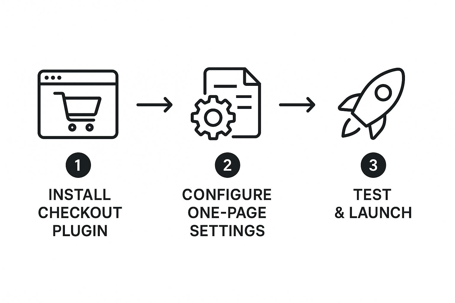
As you can see, the path is clear: install the plugin, configure its settings to create the single-page experience, and then give it a thorough test run before going live.
Configuring the Core Settings
With the plugin activated, it will almost certainly add a new menu item to your dashboard, either under the main WooCommerce tab or in the left-hand sidebar. This is your new control panel. Finding it is your next task, and it's where you'll begin shaping the checkout flow.
Every plugin has its own unique interface, but they all aim to do the same thing. You won't be diving into lines of code; most of the work involves ticking boxes and picking options from dropdown menus.
Here’s what you’ll likely be focused on:
- Enabling the one-page layout: This is the main switch. Toggling this on is what will transform your old multi-step checkout into a single, streamlined page.
- Connecting your payment provider: Think of this less as 'configuring API endpoints' and more as just telling the store how you want to get paid. You'll simply select Stripe, PayPal, or whatever you use and pop in your account details.
- Arranging the checkout fields: Any decent plugin will give you drag-and-drop control over the layout. This means you can decide the most logical order for sections like ‘Billing Details,’ ‘Shipping Information,’ and the ‘Order Summary.’
Customising the User Experience
Okay, the functional bits are sorted. Now let's make it look good. How do you want your checkout to feel? This is your chance to infuse your brand's personality into one of the most critical pages on your site.
Most quality plugins give you plenty of customisation options right out of the box. You should be able to:
- Adjust Colours and Fonts: Tweak button colours to match your branding and select fonts that are consistent with the rest of your website for a cohesive look.
- Edit Button Text: Don't just stick with "Place Order." Why not try something more engaging like "Complete My Purchase" or "Get My Goodies"?
- Choose a Layout Style: Some plugins offer different templates, like a two-column design versus a wider single-column view. See which one presents the information most clearly without overwhelming your customer.
The goal here is to create a checkout page that feels like a natural part of your shop, not some tacked-on, generic form. A consistent design builds trust and makes that final step feel completely seamless.
For UK-based shops, performance is a huge deal. With 247,593 live WooCommerce stores in the UK, the competition is fierce, making site speed a critical advantage. I've seen merchants in the UK achieve a 42% improvement in page load times and a 35% increase in checkout speeds just by using optimised themes and one-page checkout plugins. Those numbers are nothing to scoff at, as speed is directly tied to conversions.
If you hit a snag during setup—maybe a field isn't showing up correctly or a setting is confusing—don't panic. Most common issues have surprisingly simple fixes. For more specific guidance, our resource on common WooCommerce fixes is a great place to look for troubleshooting tips.
By being methodical—backup, install, configure, and customise—you're setting yourself up for success. Take your time, save your progress as you go, and always remember to look at the page from your customer's point of view.
Fine-Tuning Your Checkout for Maximum Conversions
So, you’ve got your one-page checkout live. That’s a massive step forward, but the work isn’t quite finished. Think of it like this: you’ve built a high-performance engine, but now it’s time for the final tune-up to truly unlock its power.
This is where we move beyond the basics. We’ll dive into a few simple but incredibly effective techniques to refine the user experience, build unshakable trust, and persuade more visitors to click that final purchase button.

Declutter the View with Conditional Fields
One of the easiest wins you can get is hiding fields that customers simply don't need. The classic culprit is the 'Company name' field. If you sell directly to consumers, why force every single person to see and consciously skip a field that’s completely irrelevant to their purchase? It just adds noise.
Most good one-page checkout woocommerce plugins have conditional logic built right in. It sounds technical, but it’s just a set of "if this, then that" rules. For example, you could set a rule that says: "If a customer is buying a digital download, then hide the shipping address fields." It's a small tweak that instantly makes the form feel more intelligent and personalised.
Arrange Fields for a More Natural Flow
Think about the order you're asking for information. Does it feel like a normal conversation? Most people instinctively expect to give their name and email first, then their address, and save payment details for the very end. A jumbled form can feel awkward and even confusing.
Take a quick look at your checkout from a customer’s point of view.
- Are related fields, like all the address lines, grouped together?
- Does the progression from one section to the next feel logical and smooth?
- Is the most crucial information being asked for at the right time?
If your plugin has a drag-and-drop editor, reordering fields is a breeze. Just a few small adjustments here can make a world of difference to the checkout's usability, all without touching a single line of code.
Remember, the goal is to make the process feel so smooth that the customer doesn't even have to think about it. Every element should guide them gently towards the final click.
Build Last-Minute Confidence with Trust Badges
Right before they enter their card details, a customer's mind is buzzing with one crucial question: "Can I trust this site?" This is your moment to reassure them visually.
Strategically placing trust badges near the payment section can have a real psychological impact. These are just small icons that signal security and reliability.
- Payment Logos: Showing the logos for Visa, Mastercard, PayPal, and others you accept is instantly familiar and comforting.
- Security Seals: Icons that mention SSL encryption or security partnerships demonstrate that you take data protection seriously.
There's no need to clutter the page. Just one or two well-placed badges can provide that final bit of confidence a customer needs to complete their order.
Taking the Guesswork Out with A/B Testing
So how do you know if any of these changes are actually improving things? The answer is A/B testing. Don't be put off by the term; it's simply a method for trying two different versions of something to see which one performs better.
For instance, you could test two variations of your main call-to-action button:
- Version A: "Place Order"
- Version B: "Complete My Purchase"
With A/B testing software, you'd show Version A to half your visitors and Version B to the other half. After a week or so, you can analyse the data to see which button text resulted in more sales. It removes the guesswork and lets your customers' actions dictate the best design.
These optimisations are what separate a good checkout from a great one. A fast, well-designed one-page checkout woocommerce setup is critical, and if speed is an issue, our professional speed optimization services can get your site running in top form. Taking the time to dial in these small details shows customers you respect their experience, and that’s how you earn lasting loyalty.
How to Test and Launch with Confidence
You’ve done the heavy lifting – choosing, installing, and customising your new one-page checkout for WooCommerce. Now you’re at the final, most critical stage before unleashing it on your customers. It’s tempting to rush this part, but spending a little time on thorough testing is what separates a smooth launch from a stressful one.
Think of it as the final dress rehearsal. A few minutes checking everything now will save you from a flood of lost sales and frustrated customer emails down the line. We’ll go through a practical process to make sure you’re ready to go live with total confidence.
https://www.youtube.com/embed/9kR8Ytnt0as
Run Through a Pre-Launch Checklist
Before you flip the switch, you need to step into your customers’ shoes and walk through the entire buying journey. This isn’t just about checking if things work – it’s about making sure the experience feels seamless and professional.
This practical checklist will guide you through the final testing phase, covering everything from visual consistency to simulating real payments.
Your Pre-Launch Testing Checklist
| Test Area | Action to Perform | Expected Result |
|---|---|---|
| Device & Browser Compatibility | View the checkout page on a desktop, tablet, and mobile. Use different browsers like Chrome, Firefox, and Safari. | The layout adapts perfectly. All form fields are easy to see, tap, and fill, especially on a small mobile screen. |
| Payment Gateway Functionality | Place a test order using every single payment option you offer (e.g., Stripe, PayPal). Use the 'test mode' if available. | Each transaction completes successfully, and the order status updates correctly in WooCommerce. |
| Email Confirmation System | After each test order, check your inbox and the "customer's" inbox. | Both the customer and admin order confirmation emails arrive promptly and display all the correct information. |
| Product Type Variations | Place test orders for a simple product, a product with variations (e.g., size/colour), and a cart with multiple different items. | The checkout correctly processes all product types and calculates totals accurately, including shipping and taxes. |
Running through these steps methodically ensures there are no nasty surprises waiting for you or your customers after launch.
Troubleshooting Common Hiccups
Even with the most careful planning, you might hit a small snag. Don’t panic. Most issues that pop up at this stage are common and usually have a straightforward fix.
For instance, a frequent problem is a specific payment option simply not showing up. This is almost always caused by a missing API key or a simple misconfiguration in the WooCommerce settings for that particular payment gateway. Your first step should be to double-check that all your credentials have been copied correctly and that the payment method is actually enabled.
A smooth launch isn’t about hoping for the best. It’s the result of being methodical and proactive. By identifying and fixing small issues now, you protect your revenue and your brand's reputation from day one.
The data absolutely backs up this focus on a frictionless experience. In the UK, where a massive 93.7% of WordPress e-commerce sites are built with WooCommerce, implementing a one-page checkout is directly linked to improved customer retention. In fact, average retention rates for these stores climbed from 85% in 2023 to 92% in 2024. That’s a huge leap in a market generating over £120 billion in annual sales. You can dig deeper into these commercial trends in this detailed report on e-commerce statistics.
Tracking Your Success After Launch
Going live isn’t the end of the process. Now you get to measure the impact of your hard work, and the single most important metric to watch is your cart abandonment rate.
By setting up conversion tracking in a tool like Google Analytics, you can see precisely how many people start the checkout process versus how many actually complete their purchase. Monitoring this figure before and after rolling out your one-page checkout woocommerce setup gives you hard data on its effectiveness. When that abandonment rate starts to drop, you know you’ve made a smart investment that's directly boosting your sales.
Facing a tricky issue you can’t solve, or just want an expert eye to ensure everything is perfect? Contact us to learn more about our no-fix, no-fee repair services.
Got Questions About One-Page Checkouts?
Switching up something as crucial as your checkout process naturally brings a few questions to mind. It's smart to want to be certain you're making the right move for your store. Let's tackle some of the most common queries we hear from fellow WooCommerce store owners, so you can feel confident in your decision.
Will It Slow Down My Website?
This is usually the first thing people ask, and for good reason. The worry is that cramming everything—cart contents, customer details, and payment options—onto a single page will lead to a slow, clunky experience for your customers.
But here’s the reality: modern one-page checkout plugins are built specifically to be fast. They use clever tricks like loading scripts and data efficiently, so instead of several separate page loads, you get just one optimised request. For the customer, this often makes the whole process feel significantly quicker, and that perceived speed is what really drives conversions.
Is a One-Page Checkout Secure?
Absolutely. It's a common misconception, but the layout of your checkout page has zero impact on how secure your payment processing is.
Your checkout's security isn't determined by its design; it's handled entirely by your payment gateway. Whether you use Stripe, PayPal, or another trusted provider, they manage all the sensitive card data on their secure, encrypted servers.
Think of your one-page checkout as just a well-designed form. When a customer types in their card number, that data is sent directly to the payment processor’s heavily-fortified system, never even touching your own server. This keeps your customers' information protected by industry-leading security, no matter how your checkout page looks.
Can I Still Use Upsells and Cross-Sells?
Many store owners worry that a streamlined checkout means sacrificing those valuable opportunities to increase the average order value. Thankfully, that's not the case at all. You can easily integrate these powerful sales tactics into a single-page flow.
A good one-page checkout woocommerce plugin gives you the tools to place offers strategically, right when a customer is most likely to say yes.
- Order Bumps: These are those little checkbox offers you see just before the final payment button. It’s the perfect spot for a low-cost, high-value add-on, like extended warranties or gift wrapping. It’s an easy, frictionless "yes".
- Post-Purchase Upsells: This is a fantastic technique where you present a special, one-time offer after the initial payment is complete but before the customer hits the final thank you page. Since their payment info is already saved, they can accept the offer with just a single click.
Using these methods means you can actually boost your revenue without adding any friction to the main purchase journey.
Feeling a bit stuck with the technical side of things or just want a second opinion? The team at LINX Repair Websites lives and breathes this stuff. We offer expert, no-fix, no-fee WooCommerce support to get your store running flawlessly. Get in touch to learn more.