Does it feel like your website gets plenty of visitors, but not enough of them take that next step? Whether you want them to make a purchase, fill out a form, or sign up for your newsletter, turning that traffic into action is what it's all about. The good news is, you don't need a massive overhaul to see a real difference. Improving website conversion rates is often about making smart, targeted tweaks that make it easier and more appealing for your visitors to say ‘yes’.
Think of this guide as your friendly, practical roadmap. We’ll walk you through 10 proven strategies, breaking down complex ideas into simple, actionable steps you can start using today. We'll cover everything from the data-driven world of A/B testing to the critical importance of a lightning-fast website. Each point is designed to help you understand not just what to do, but why it works. Let’s get started and turn those casual browsers into loyal customers.
1. Get Comfortable with A/B Testing
Guesswork can be costly when you're trying to improve website conversion rates. A/B testing, also called split testing, is a simple method that replaces assumptions with real data. It involves creating two versions of a webpage element—like a headline or a button—to see which one performs better.
The process is pretty straightforward: you split your website traffic between the original version (the 'control') and the new version (the 'variant'). By measuring how users interact with each, you can see for certain which one leads to more conversions. This data-driven approach allows you to make small, evidence-based improvements over time. For example, HubSpot once found that changing a button's colour from green to red boosted their conversions by 21%. It shows that even tiny changes can lead to big results.
The A/B Testing Workflow
To make sure your A/B tests give you reliable results, it helps to follow a structured process. This keeps your efforts focused on changes that will have the biggest impact. The key steps are identifying a goal, forming a hypothesis (an educated guess), creating a variation, and running the test long enough to get a clear winner.
The infographic below gives a simple overview of how an A/B test works.
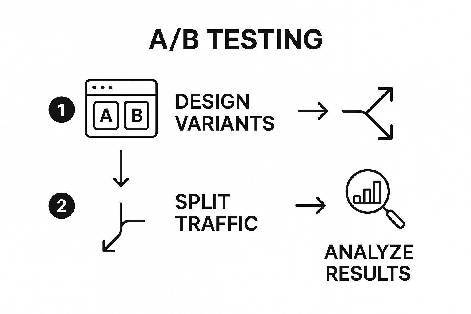
This visual shows how you move from creating different designs to splitting your audience and, finally, making a decision backed by data. Following this organized flow is the best way to get clear, actionable insights into what your users really want.
2. Optimise Your Landing Pages
Sending targeted traffic to a generic homepage often doesn't work very well. Landing page optimisation is all about creating dedicated, standalone web pages designed for a specific campaign or offer. This approach removes distractions (like a busy navigation menu) and focuses the visitor's attention on a single goal, creating a clear path to action. By matching the page's message and design with the ad or email that brought them there, you create a smooth and persuasive journey for the user.
This focused strategy is a cornerstone of improving website conversion rates because it directly addresses what the user is looking for. A visitor who clicks an ad for "vegan leather boots" expects to land on a page about exactly that, not a general shoe category page. This alignment builds trust and makes your offer feel much more relevant.
Key Elements of a High-Converting Landing Page
To create a great landing page, focus on a few core components that work together to guide the user toward your goal. These elements ensure your message is clear, build trust, and remove any friction that might stop someone from converting.
A successful landing page usually includes:
- A Matching Message: Make sure the headline on your landing page perfectly matches the ad or link the visitor clicked to get there.
- A Singular Focus: Remove all unnecessary links, sidebars, and competing buttons to keep the user focused on the main goal.
- Compelling Visuals: Use a high-quality image or video that is directly related to your offer and resonates with your audience.
- A Clear Value Proposition: Immediately tell visitors the main benefit of your offer in a clear, concise headline.
- Social Proof: Add testimonials, case studies, or logos of well-known clients to build credibility and trust.
- Streamlined Forms: Keep your forms as short as possible. Only ask for the information you absolutely need to reduce user effort.
3. Perfect Your Call-to-Action (CTA)
A Call-to-Action (CTA) is the part of your page—usually a button or a link—that tells users what to do next. Optimising your CTAs means refining these prompts to encourage more people to take that desired action. Without a clear, compelling CTA, even the most interested visitors might leave your site without converting, which makes this a critical piece of the puzzle for improving website conversion rates.
The goal is to remove any hesitation and add a bit of motivation. This involves making smart choices about your CTA's wording, colour, size, and placement. For example, changing CTA text to be more personal can make a big difference. Similarly, one famous test showed that simply changing a button to a high-contrast red colour boosted conversions by a staggering 90%. It just goes to show that small tweaks can deliver huge results.

Making Your CTAs More Effective
To make your CTAs better, focus on making them easy to understand and impossible to ignore. The best CTAs are specific, create a sense of value, and stand out visually from the rest of the page.
Here are a few simple tips to get you started:
- Use action-oriented, first-person language: Phrases like "Get My Free Quote" often work better than vaguer alternatives like "Get Your Quote."
- Create contrast with colour: Your button's colour should pop against the background, drawing the user's eye right to it.
- Think about placement: Test placing your CTA in different spots on the page. Sometimes users need to read a bit more before they’re ready to click.
- Add a touch of urgency: Using time-sensitive words like "Shop the Sale Now" or "Limited Time Offer" can encourage people to act immediately.
4. Build Trust with Social Proof
We humans are social creatures. We often look to what others are doing to guide our own decisions. Social proof is a simple but powerful idea that uses this tendency to build trust. It’s all about showing potential customers that other people have already tried your product or service and had a great experience. This helps reduce any anxiety they might feel and makes them more confident in their decision.
This strategy validates a visitor's choice by providing a credible, third-party endorsement. Think about Amazon’s customer reviews—they are a huge part of its success and influence countless purchasing decisions. Another great example is how the project management tool Basecamp increased its sign-ups by over 100% just by adding the logos of their well-known customers to their homepage. It proves that showing off your popularity is a key part of improving website conversion rates.
How to Add Social Proof to Your Site
To use social proof effectively, strategically place authentic evidence where it will have the most impact, like on product pages or near "Add to Cart" buttons. The goal is to reassure users at those critical decision-making moments.
Here are a few ways to add compelling social proof:
- Use detailed testimonials: Go beyond generic praise like "Great service!" Instead, use specific stories that highlight real benefits. Adding a name and a photo makes them feel even more authentic.
- Show real-time activity: Tools that display notifications like "Someone in London just purchased this" can create a sense of urgency and popularity.
- Display trust badges and awards: Showcasing industry certifications, awards, or security badges (like an SSL certificate) signals that you're credible and professional.
- Feature case studies: For B2B businesses, in-depth case studies with data-backed results can be incredibly persuasive, offering solid proof of your value.
5. Focus on Website Speed and Performance
In today's fast-paced digital world, nobody likes to wait. Website speed isn't just a technical detail anymore; it's a huge factor in user experience and, as a result, your conversion rates. A slow-loading site frustrates visitors, often causing them to leave before they even see what you have to offer. Optimising your site’s performance ensures a smooth, seamless experience that keeps people engaged from the first click.
The impact of speed is well-documented. Amazon famously calculated that just a 100-millisecond delay costs them 1% in sales, while Walmart saw a 2% increase in conversions for every one-second improvement in load time. These numbers tell a simple story: a faster website provides a better user experience, which is essential for improving website conversion rates.

Core Principles of Speed Optimisation
To give your site's speed a boost, you'll need to address a few technical elements. These optimisations work together to reduce the time it takes for your pages to load and become interactive. Some key strategies include compressing your images to reduce their file size, using "lazy loading" so that images only load as a user scrolls down the page, and minimising unnecessary code that can slow things down.
Choosing a fast, reliable hosting provider is the foundation of a high-performing website. For those who want to take it a step further, a professional WordPress speed optimisation service can offer specialised help to diagnose and fix complex performance issues, ensuring your site is running at its absolute best.
6. Prioritise the Mobile Experience
With the majority of web traffic now coming from mobile devices, a poor mobile experience is a sure-fire way to lose conversions. Mobile optimisation means ensuring your website provides a seamless and enjoyable experience for visitors on smartphones and tablets. This goes beyond just shrinking your desktop site; it requires a thoughtful approach to layout, navigation, and usability on a smaller screen.
The key principle here is responsive design, which allows a site's layout to adapt smoothly to any screen size. This isn't just a nice-to-have; it's critical for improving website conversion rates. For example, after a mobile-first redesign, the clothing brand O'Neill saw its mobile revenue increase by over 65%. A great mobile-friendly interface has a direct impact on how users engage with your site—and whether they decide to buy.
Key Practices for Mobile Optimisation
To get mobile optimisation right, you have to prioritise usability and speed. A "mobile-first" mindset means designing for the smallest screen first and then scaling up to larger ones. This ensures that the core user journey is clear and functional, even on the most limited devices.
Here are some helpful tips to guide your mobile optimisation efforts:
- Design for Touch: Make sure buttons and links are large enough for people to tap easily with their thumbs—around 44×44 pixels is a good rule of thumb.
- Simplify Navigation and Forms: Streamline your menus and reduce the number of fields in your forms to make things less frustrating for mobile users.
- Prioritise Page Speed: Mobile users are often on slower connections, so it's extra important to compress images and streamline code to ensure your pages load quickly.
- Test on Real Devices: While emulators are helpful, nothing beats testing your site on actual smartphones and tablets to find real-world usability issues.
By focusing on a clean, fast, and intuitive mobile experience, you're catering to the largest segment of your audience and creating a smoother path to conversion.
7. Simplify Your Forms
Every form on your website—from a simple contact request to a checkout process—is a crucial conversion point. Form optimisation is all about streamlining these forms to reduce friction and encourage more people to complete them. The goal is to make providing information as quick and painless as possible, removing any barriers that might cause someone to give up.
The impact of this strategy on improving website conversion rates can be huge. In a famous example, Expedia increased its annual profit by $12 million just by removing one optional field from its booking form. This highlights a core principle: every extra field you ask a user to fill out adds a bit of friction and could lower your conversion rate.
How to Simplify Your Forms
Good form design is more than just deleting fields; it involves thoughtful design that guides users through the process effortlessly. To do this well, focus on creating a seamless experience. Ask for only the most essential information, use clear labels, and provide helpful error messages.
- Minimise Fields: Only ask for information that is absolutely necessary. You can always gather more details later on.
- Use a Single-Column Layout: Single-column forms are usually easier for people to scan and complete quickly compared to multi-column layouts.
- Group Related Fields: Organise information into logical sections, like 'Personal Details' and 'Shipping Information,' to make the form feel less intimidating. This is a key benefit of a well-structured one-page checkout process.
- Provide Clear Error Messages: If something goes wrong, instantly tell users what it is and how to fix it, so they don't get frustrated and leave.
8. Make it Personal
A one-size-fits-all approach just doesn't cut it anymore. Personalisation is about tailoring your website’s content, offers, and overall experience to individual visitors based on things like their behaviour, location, or how they found your site. By delivering content that feels highly relevant to each person, you create a more engaging experience that makes them much more likely to convert.
This strategy moves beyond generic messaging and creates a more individualised conversation. It uses data to show visitors the right content at the right time, making them feel understood and valued. For example, Amazon’s recommendation engine, which customises what each user sees, is reportedly responsible for up to 35% of its sales. It’s a powerful demonstration of how a personalised journey can be key to improving website conversion rates.
How to Get Started with Personalization
You don't need to overhaul your entire site to start personalising the experience. You can begin with small, targeted changes and gradually introduce more advanced tactics. The key is to use data to make informed decisions about what will resonate most with different segments of your audience.
- Start with basic segmentation: Group visitors by how they arrived (e.g., social media vs. organic search) and tailor your landing page headlines or offers to match.
- Use browsing behaviour: Show product recommendations based on items a user has previously looked at or added to their cart.
- Personalise your calls-to-action (CTAs): Change the CTA text for new visitors versus returning customers. A new visitor might see "Learn More," while a returning customer sees "View Your Loyalty Offers."
- Respect user privacy: Always be transparent about how you collect data and provide clear opt-out options. This helps build and maintain trust with your audience.
9. Add Trust Signals and Security Features
Before a visitor will convert, they first need to trust your website. Trust signals are the little visual cues that show your site is credible and make users feel safe enough to share their information or make a purchase. These elements help reduce anxiety and reassure visitors that their data is secure and your business is legitimate.
From SSL certificates and security badges to clear contact information and a professional design, these signals are crucial for improving website conversion rates. Their impact is significant; for example, one company boosted its conversions by 42% just by adding trust badges to its site. This is especially important for e-commerce or any site where you ask for personal data.
How to Implement Trust Signals Effectively
To successfully build visitor confidence, you should place various trust signals throughout your website, especially at key decision-making points like checkout pages and sign-up forms. The goal is to make trust a natural part of the user experience.
Here are some simple ways to do this:
- Display Security Badges: Place well-known security logos like McAfee SECURE or Norton Secured near payment forms.
- Showcase an SSL Certificate: Make sure your site uses HTTPS. The little padlock icon in the browser's address bar is a powerful and universally recognised trust signal.
- Be Transparent: Clearly display your physical address, phone number, and a privacy policy. This shows that you are a real, accountable business.
- Leverage Social Proof: Feature customer reviews and testimonials to show that others have had positive experiences with your brand.
- Maintain a Professional Design: A high-quality, error-free website design inherently builds more trust than a site that looks outdated or unprofessional.
For WordPress users, reinforcing your site's security is a foundational trust element. You can explore this further by learning about the best WordPress security plugins on linxrepairwebsites.com.
10. Use Exit-Intent Popups (Wisely)
Even on the best websites, some visitors will leave without converting. Exit-intent technology gives you one last chance to engage these users. It works by detecting mouse movements that signal someone is about to leave the page. When this happens, a targeted popup appears with a compelling last-chance offer. This can be a powerful tool for improving website conversion rates by preventing cart abandonment and capturing leads that would otherwise be lost.
This proactive approach lets you engage a user at the exact moment they’re about to disengage. For example, an e-commerce site might offer a 10% discount, while a blog could offer a free ebook in exchange for an email. The key is to provide immediate and undeniable value. When done right, this method can be very effective at recovering visitors who were on the fence.
Making a Lasting Impression
To use exit-intent popups effectively, your offer must be genuinely valuable and presented in a way that isn't annoying. The goal is to interrupt the user's departure with a compelling reason to stay, not to create a frustrating experience.
Here are a few tips for getting it right:
- Offer Genuine Value: Provide a special discount, exclusive content, or a free trial that isn't available elsewhere on your site.
- Use Compelling Copy: Write a clear, attention-grabbing headline that instantly explains the benefit.
- Control the Frequency: Limit how often a single user sees the popup to avoid irritating repeat visitors.
- Make it Easy to Close: A clearly visible and functional close button is essential for maintaining a positive user experience.
- A/B Test Everything: Experiment with different offers, headlines, and designs to discover what resonates most with your audience.
Top 10 Website Conversion Improvement Strategies Comparison
| Item | Implementation Complexity (🔄) | Resource Requirements (⚡) | Expected Outcomes (⭐📊) | Ideal Use Cases (💡) | Key Advantages (⭐) |
|---|---|---|---|---|---|
| A/B Testing and Experimentation | Medium to High: statistical setup and analysis | High: requires significant traffic and time | Reliable data-driven decisions; measurable ROI; continuous improvement | Validating changes; optimizing specific page elements | Eliminates guesswork; automated winner selection; low risk |
| Landing Page Optimization | Medium: design and maintenance of dedicated pages | Medium to High: creation of multiple pages | Higher conversion rates; better ad Quality Score; improved UX | Campaigns needing focused conversion paths | Message consistency; easier tracking; higher conversions |
| CTA Optimization | Low: mostly design and copy tweaks | Low: quick implementations possible | Increased click-through and conversion rates | Any marketing or product page | Cost-effective; fast impact; easy to test |
| Social Proof Integration | Low to Medium: content collection and display | Low to Medium: ongoing content management | Builds trust; reduces hesitation; increases credibility | E-commerce; lead generation; new product launches | Cost-effective; works across industries |
| Website Speed and Performance Optimization | High: technical expertise and infrastructure changes | Medium to High: often requires investment | Improved UX; reduced bounce; higher SEO and conversion rates | All websites aiming for performance and SEO benefits | Direct impact on user retention and rankings |
| Mobile Optimization and Responsive Design | High: complex development and testing | High: redesign and ongoing maintenance | Better mobile UX; higher mobile conversions; SEO improvements | Mobile-heavy traffic sites | Future-proof design; consistent cross-device experience |
| Form Optimization and Simplification | Medium: design and usability improvements | Low to Medium: depends on form complexity | Increased form completions; improved data quality | Lead capture, sign-ups, checkout forms | Reduced user friction; quick wins with clear impact |
| Personalization and Dynamic Content | High: complex data integration and maintenance | High: data collection, algorithms, tools | Higher engagement, relevance, conversions | User-specific marketing; e-commerce recommendations | Enhanced loyalty; increased lifetime value |
| Trust Signals and Security Features | Low to Medium: adding badges and policies | Low: mostly marketing assets and setup | Increased credibility and conversions; reduced anxiety | E-commerce; financial services; lead capture | Easy to implement; builds immediate trust |
| Exit-Intent Popups and Retargeting | Medium: setup of tracking and popup logic | Medium: design, segmentation, and testing | Recovers abandoning visitors; boosts email lists and conversions | E-commerce carts; lead generation with exit risks | Immediate ROI; customizable targeting |
Bringing It All Together
We’ve walked through a whole toolkit of strategies, each one designed to make your website work harder for you. From the data-driven precision of A/B testing to the foundational importance of site speed, it’s clear that improving website conversion rates isn't about finding one magic bullet. Instead, it’s about making a series of smart, user-focused improvements that add up to a seamless and compelling experience for your visitors.
The path to a higher-performing website is built on a simple idea: understand your visitors, remove any obstacles in their way, and gently guide them toward your goal. Every strategy we’ve talked about, whether it's simplifying a form or personalising content, comes from this user-centric philosophy. Think of your website not as a static brochure, but as a dynamic conversation with your audience.
Your Next Steps
The number of things you could do can feel overwhelming, but progress starts with a single step. Here’s a simple way to get started:
- Start with Data: Begin by looking at your current performance. Use a tool like Google Analytics to find your weakest links. Where are people dropping off? Which pages have the highest bounce rates? Your data will point you toward the areas that need the most attention.
- Pick One or Two Things: Choose a strategy from this guide that directly addresses the problem you’ve identified. If your mobile bounce rate is high, focus on your mobile design. If trust seems to be an issue, start by adding security badges and customer reviews.
- Test and Measure: Never just assume a change will work. Implement your chosen strategy and measure the results (A/B testing is perfect for this). This cycle of implementing, testing, and learning is the real engine of conversion rate optimisation.
Ultimately, getting better at improving website conversion rates is about adopting a mindset of continuous improvement. It’s about being curious about your users, being brave enough to try new things, and being disciplined enough to let data guide your decisions. By consistently refining your website, you're not just chasing higher numbers; you're building a more valuable and successful online presence that truly serves your audience and your business goals.
If technical glitches, a slow WordPress site, or persistent errors are getting in your way, our team at LINX Repair Websites can help. We specialise in fixing the underlying issues that hurt user experience and conversions, ensuring your site is a stable, high-performing foundation for growth. Contact us to learn more.