Meta Description: Seeing a high bounce rate? Don't panic. Our guide offers reassuring, practical steps on how to reduce website bounce rate and improve user engagement.
It’s a feeling every website owner knows: you check your analytics, and your heart sinks a little. People are visiting your site, but they’re leaving almost as quickly as they arrive. This is called a “bounce,” and while it’s frustrating, it’s also a completely solvable problem.
Getting your bounce rate down isn’t about tricking people into staying. It’s about creating a welcoming, helpful experience that gives them exactly what they were hoping to find. Think of it as a friendly handshake—it starts with a fast-loading page, content that answers their question, and navigation so simple they don’t even have to think about it. Let’s walk through how to make that happen.
Why Do Visitors Leave Your Website So Quickly?
We’ve all been there. You see someone land on your site, and just as quickly, they’re gone. It's frustrating, but it’s almost always a fixable problem. Before you get lost in analytics, the first thing to do is think about the human reasons someone might leave. Try to see your site through their eyes for a moment.
When someone bounces, it’s not a random click. It’s a reaction. They came to your site with a goal—to find an answer, solve a problem, or buy something—and something immediately signalled that they were in the wrong place.
The Most Common Reasons for a Quick Exit
So, what are these instant deal-breakers? From our experience, they almost always fall into a few predictable buckets that derail a visitor’s experience right from the get-go. Someone might leave because:
- The page is just too slow. We've all become incredibly impatient online. Research consistently shows that even a few seconds of loading time can cause the probability of a bounce to skyrocket by over 100%. Waiting is simply not an option anymore.
- The content is a poor match for their search. Imagine someone googles "budget-friendly running shoes" and your page serves up nothing but premium, high-end trainers. That's a classic mismatch. They'll feel like you wasted their time and click away instantly.
- The navigation is a confusing mess. A cluttered menu, a hidden search bar, or a chaotic layout is like trying to navigate a maze without a map. If people can't figure out where to go next within a few seconds, they’ll give up.
At its heart, a high bounce rate is almost always a sign that you've failed to meet a visitor's expectations. Your website could be beautifully designed, but if it doesn't deliver on the promise that brought them there, they have no reason to stick around.
This "visitor-first" mindset is everything. It’s not about blaming people for being impatient; it’s about finding and fixing the friction that’s actively pushing them away. The moment you start seeing your website from their perspective, the problem areas become glaringly obvious.
Getting a handle on these foundational issues is the perfect setup for the practical, actionable fixes we'll dive into next. By tackling these core user experience problems, you’re doing more than just lowering a number on a dashboard—you’re building a website that’s more welcoming, effective, and ultimately, more successful.
Improving Your User Experience to Keep Visitors
A great user experience (UX) is your secret weapon against a high bounce rate. It's not about flashy gimmicks; it's about making your website feel intuitive, welcoming, and genuinely helpful from the moment someone lands on it. When visitors feel comfortable and can easily find what they're looking for, they have every reason to stick around.
Think of it like being a guest in someone's home. If the layout is clear and you feel welcome, you'll relax and explore. But if it's cluttered and confusing, your first instinct is to head for the door. Your website works the exact same way.
Make Navigation Effortless
We’ve seen it time and time again: poor navigation is one of the fastest ways to lose a visitor. If people can't figure out where to go next, they won't stick around to solve the puzzle. Your goal is to make getting around your site feel completely thoughtless.
Here are a few pointers to get you started:
- Keep Your Menu Simple: Use clear, straightforward labels like "Services" or "Contact." Ditch the confusing jargon or overly clever names that only make sense to you.
- Include a Search Bar: A prominent and effective search bar is a must, especially for larger sites with lots of content. It gives people a direct path to what they want.
- Use Smart Internal Links: Guide visitors to other relevant content on your site. For example, a blog post discussing website speed should absolutely link to a more detailed guide on how to fix slow loading times.
Prioritise Readability and Clean Design
Have you ever landed on a page that was just a massive wall of text? It’s completely overwhelming. The reality is, people don't read websites word-for-word; they scan them. Your design needs to support this behaviour by making your content incredibly easy to digest.
Focus on creating plenty of white space. Use clear, descriptive headings (like the ones in this post!) and keep your paragraphs short and punchy. Bullet points and numbered lists are also fantastic tools for breaking up text and highlighting key information.
A clean, scannable layout respects your visitor's time. It shows you've organised your information thoughtfully, making it easy for them to find the answers they need without getting frustrated.
The image below gives a great visual breakdown of how bounce rates can differ across various types of websites, really highlighting how user expectations change with context.
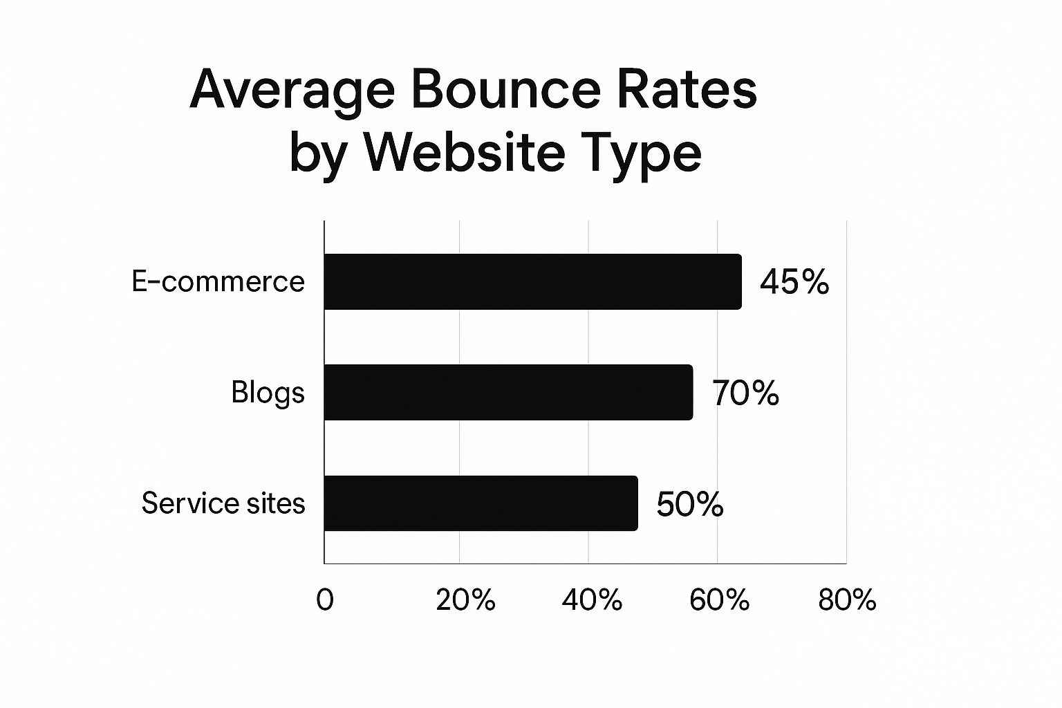
As you can see, someone visiting an e-commerce site is often in a "browsing" mindset and more likely to click around, whereas a blog visitor might just want a single piece of information and then leave. It's all about context.
To really nail your UX, it helps to break down the core elements that visitors interact with. The table below outlines some crucial factors, why they matter so much, and a quick, actionable tip for each.
Key User Experience Factors and Their Impact on Bounce Rate
| UX Factor | Why It Matters | Quick Win to Implement |
|---|---|---|
| Simple Navigation | If visitors can't find what they want in a few clicks, they'll leave. Confusion is the enemy of conversions. | Consolidate your main menu to 5-7 essential items. Use clear, common language. |
| Readability | Walls of text are intimidating. Scannable content lets users find information quickly and without strain. | Break up long paragraphs. Use headings, subheadings, and bullet points to guide the eye. |
| Mobile Responsiveness | A significant portion of your traffic is on mobile. A clunky mobile site is a guaranteed bounce. | Use your browser's "Inspect" tool to preview your site on different device sizes. Fix any layout issues. |
| Call-to-Action (CTA) | A clear CTA tells the visitor what to do next. Without one, they may simply leave, unsure of their next step. | Make your CTA buttons a contrasting colour and use action-oriented text like "Get a Free Quote" or "Read More." |
By focusing on these specific areas, you're not just making your site look better—you're making it work better for the people who matter most: your visitors.
Ensure a Flawless Mobile Experience
In this day and age, a poor mobile experience is simply not an option. If your site is difficult to use on a smartphone, you're actively pushing away a massive portion of your audience. Pinching and zooming to read text or trying to tap tiny, fiddly buttons is a recipe for a bounce. It's critical that your WordPress site is fully responsive, meaning it adapts perfectly to any screen size.
The good news is that focusing on user experience really pays off. Just look at the e-commerce industry in the UK, which has seen fantastic results from improving UX. The average bounce rate for UK e-commerce sites dropped from a high of 55.1% in early 2023 to just 36.87% a year later. This huge improvement was driven by simple strategies like faster loading times and better site navigation.
Making these user-focused improvements will do more than just lower your bounce rate; it will build trust and encourage visitors to come back for more. If you know your WordPress website is loading slow, tackling that issue is probably one of the most impactful UX improvements you can possibly make.
Why Page Speed Is Non-Negotiable

If there's one thing guaranteed to make a visitor hit the 'back' button, it's a slow-loading website. We live in an age of instant gratification, and online, patience is in seriously short supply. A delay of just a couple of seconds can be the deciding factor between gaining a new reader and losing them forever.
The relationship is brutally simple: the faster your site, the happier your users. Research has shown that as a page load time creeps up from one to three seconds, the likelihood of a bounce shoots up by 32%. Let that stretch to ten seconds, and the probability of someone leaving skyrockets by over 123%. Speed isn't just a techy detail; it's a fundamental part of the user experience and a massive signal to search engines.
The Usual Suspects Slowing You Down
So, what’s actually putting the brakes on your site? In our experience, the culprits are almost always the same—and thankfully, they're entirely fixable. Getting to know these common issues is the first real step to getting your site back up to speed.
Here's what we find slowing down websites most often:
- Bloated Image Files: Huge, high-resolution images might look stunning, but if they aren't optimised, their massive file sizes will drag your load times into the mud.
- Inefficient Code: Messy CSS and JavaScript files create more work for the browser, adding precious seconds to the rendering process.
- Poor Web Hosting: That bargain-bin shared hosting plan might seem like a great deal, but it often crumbles under pressure, leading to slowdowns precisely when you can't afford them.
Practical Fixes to Speed Things Up
The good news is you don't need to be a coding wizard to make a real difference. A few straightforward changes can dramatically improve your site’s performance and go a long way in answering the question of how to reduce website bounce rate.
A great place to start is by running your site through a free tool like Google’s PageSpeed Insights. It gives you a clear performance score and, more importantly, a checklist of things to fix. As you get into diagnosing the problems, our guide on the best website performance monitoring tools can be a huge help.
A faster website isn't just about keeping Google happy. It's about respecting your visitor's time and giving them the smooth, professional experience they expect. Prioritise performance, and you'll see engagement improve and bounces drop.
Here are a few high-impact fixes you can tackle right now:
- Compress Your Images: Use a WordPress plugin or an online tool to shrink your image file sizes without any noticeable loss in quality. Even better, convert them to modern formats like WebP.
- Turn On Browser Caching: Caching tells a visitor's browser to save parts of your site, like your logo and CSS files. This means on their next visit, the page loads almost instantly.
- Minify Your Code: This sounds technical, but it’s just the process of stripping out unnecessary characters (like extra spaces) from your code files, making them smaller and faster for a browser to download.
Focusing on these performance tweaks creates a much better first impression, giving people a reason to stick around, explore your content, and ultimately, convert.
Crafting Content That Captures and Holds Attention

You can have the fastest, most beautifully designed website in the world, but if the content doesn't deliver, it’s all for nothing. When someone clicks through from a Google search, they’ve got a specific question or problem in mind. If your page doesn't instantly convince them they're in the right place, they'll hit that back button without a second thought.
This is where understanding search intent becomes your secret weapon. It’s all about creating a seamless match between the query someone types into their search bar and the solution you provide on the page. You have to fulfil the promise your search result made and give them exactly what they came for.
Align Your Content With Search Intent
Think of search intent as the "why" behind a search query. Is the person looking to learn something, compare different options, or are they ready to buy? Your content has to be perfectly in tune with that motivation.
For instance, someone searching for "how to fix a leaky tap" is after a practical, step-by-step guide. They'll probably appreciate a few clear images or even a short video. What they don't want is a hard-sell landing page for a local plumber. Serving them the wrong type of content is a one-way ticket to a high bounce rate.
A high bounce rate is often just a symptom of a content mismatch. The most effective way to lower it is to step into your visitor’s shoes and ask: "Does this page give me the answer I was looking for, quickly and clearly?"
This isn’t just theory; you can see it in action everywhere. Take the UK consumer electronics market. A site like Amazon.co.uk maintains a bounce rate of just 34.96%. Why? Because its product pages, customer reviews, and "people also bought" sections are perfectly aligned with a shopper's intent. Meanwhile, other retail sites with less focused content often see bounce rates climbing over 50%. Digging into the data on user engagement across different retail sites really highlights how much this matters.
Format for Scannability and Engagement
Let’s be honest: people don't read online; they scan. Their eyes dart across the page, hunting for headings, keywords, and phrases that catch their attention. Your job is to make that process effortless.
Start with the ‘inverted pyramid’ writing style—get your most important information right at the top. Don't bury the conclusion halfway down the page! From there, it's all about breaking up the text so it’s easy on the eyes.
- Use Clear Headings and Subheadings: These act as signposts, guiding readers through your article. Make them descriptive.
- Keep Paragraphs Short: Aim for one main idea per paragraph. A good rule of thumb is to stick to two or three sentences, max.
- Leverage Lists: Bullet points and numbered lists are brilliant for breaking down complex information into bite-sized chunks.
- Include Engaging Visuals: A well-placed image, infographic, or video can often explain a concept far better than a block of text ever could.
Guide Visitors with a Clear Call-to-Action
Finally, every single page on your site needs a purpose. Once a visitor has found the answer they were looking for, what do you want them to do next? If you don't give them a clear next step, you’ve led them to a dead end. Of course they're going to leave.
A strong Call-to-Action (CTA) transforms a passive reader into an active participant. It gives them a reason to stick around. This doesn't have to be aggressive; it could be a simple "Read more about our services" or "Download your free checklist." By providing a logical next step, you encourage them to explore your site further, which is a surefire way to keep that bounce rate down.
Optimise for Different Types of Traffic

It’s easy to think of "website visitors" as one big group, but that's a mistake. The reality is, someone who lands on your site from a highly specific Google search has a totally different intent than someone who just clicked a link while scrolling through Instagram.
Getting a handle on where your traffic is coming from is fundamental to bringing your bounce rate down.
Think about it from their perspective. A visitor from an organic search is on a mission; they have a problem and they’re actively seeking a solution. In contrast, someone browsing social media is in a much more passive, discovery-focused mindset. If your landing page greets both of them with the exact same message, you’re almost guaranteed to lose one of them.
This is precisely why a one-size-fits-all website strategy often falls flat. The trick is to tailor the user experience to match the visitor's expectations, which are shaped by how they got there in the first place. By customising landing pages and content for each traffic channel, you create a far more relevant and welcoming first impression.
Align Your Pages with Their Source
Let's dig into the most common traffic channels. Each one needs a slightly different approach to make visitors feel like they’ve arrived at the right destination.
-
Organic Search Traffic: These people want answers, and they want them now. Your page content absolutely must align with the keywords they searched for. Use clear headings, get straight to the point, and make your information easy to scan. No fluff.
-
Social Media Traffic: Visitors from platforms like Facebook or LinkedIn are usually drawn in by compelling visuals and a good story. Your landing page needs to mirror that vibe with strong imagery, short paragraphs, and a single, clear focus so you don't overwhelm them.
-
Paid Ad Traffic: This is non-negotiable. If someone clicks your ad, the landing page has to deliver exactly what that ad promised. Any disconnect in the offer, the messaging, or even the design will trigger an immediate bounce. Consistency is king here.
-
Email Marketing Traffic: Your subscribers already know you, so you can be a bit more direct. The page should logically follow on from the email's content and guide them towards one specific action, whether that's checking out a new product or reading a blog post.
A visitor's journey doesn't begin on your website—it begins with the link they clicked to get there. Honouring that context is one of the most powerful things you can do to lower your bounce rate.
Know Your Channel Benchmarks
It's also completely normal for bounce rates to differ wildly from one channel to the next. For instance, UK digital marketing studies often show that display advertising has the highest average bounce rate at around 56.5%, simply because users are less engaged. Social media isn't far behind at 54%.
On the flip side, referral traffic—where someone clicks a link from another trusted website—tends to have a much healthier average of 37.5%. Organic search is also quite strong, sitting around 43.6%. You can discover more insights about these traffic benchmarks to get a better feel for how your own site measures up. Knowing these numbers helps you set realistic goals for each source instead of aiming for an impossible universal target.
Common Questions About Reducing Bounce Rate
https://www.youtube.com/embed/e_ALyRx4bvk
Even after putting some solid strategies in place, it's completely normal to have a few questions rattling around about your website's bounce rate. Let's tackle some of the most common ones that crop up once business owners start digging into their analytics.
Think of this as fine-tuning your approach. Getting these details right helps you make smarter decisions and sets you up with realistic expectations.
What Is a Good Bounce Rate for a UK Website?
This is the million-pound question, and the honest answer is: it depends. There isn't a single magic number, as a good benchmark varies wildly depending on your industry and the kind of website you're running.
That said, here are some general guidelines for the UK market to give you a rough idea of where you stand:
- Excellent: A bounce rate between 26% and 40% is brilliant. It shows your visitors are genuinely engaged with what they've found.
- Average: Anything from 41% to 55% is pretty standard across many types of websites.
- Needs Improvement: If you're creeping up above 70%, that's a clear signal you've got some work to do.
It’s all about context. A content-heavy blog, for instance, will almost always have a higher bounce rate than an e-commerce site. Someone might land on a blog post, find the exact answer they were looking for, and leave perfectly happy. That's a successful visit, even if it counts as a bounce.
How Long Does It Take to See a Lower Bounce Rate?
Patience is a virtue here. How quickly you see a drop in your bounce rate really hinges on the types of changes you've made.
If you’ve implemented technical fixes—like boosting your page speed or clearing out broken links—you could see a positive shift in just a few days. The effect is almost immediate because users experience a smoother, faster site right away.
For more strategic changes involving your content or the overall user experience, it’s a bit of a longer game. You'll probably need a few weeks, maybe even a month, to collect enough data in your analytics to spot a real, consistent downward trend. It’s all about monitoring your progress and giving your hard work time to pay off.
Can Pop-ups Really Increase My Bounce Rate?
Yes, they absolutely can, especially when they're intrusive. We've all been there: a massive pop-up blocks the whole screen the second a page loads. It’s frustrating, it disrupts the journey, and it’s one of the fastest ways to send visitors running for the back button.
Thoughtless pop-ups get in the way of what your visitor came to do. A well-timed, helpful pop-up, however, can actually enhance the experience and guide them toward a valuable action.
But it's not all bad news. When used cleverly, pop-ups can be a powerful tool. Take an exit-intent pop-up, for example. It only appears when a user is about to leave your site. Offering a last-minute discount or a helpful resource at that exact moment can be a great way to secure a sale or capture a lead without hurting your bounce rate. The key is to be helpful, not disruptive.
Ultimately, getting your bounce rate down is a massive step towards improving your overall website conversion rates. Every visitor you manage to keep on your site is another chance to build a relationship and grow your business.
If you're struggling to diagnose and fix the issues causing your high bounce rate, our team is here to help. We offer fast, transparent WordPress repairs to get your site back on track and create a better experience for your visitors. Contact us to learn more.