Seeing visitors on your e-commerce site is great, but turning those visitors into customers is what really matters. If you're wondering how to improve your ecommerce conversion rates, you're in the right place. It’s not about finding a single magic button, but about making a series of thoughtful, customer-focused improvements to your website. This guide will walk you through a clear, step-by-step process, starting with understanding where you are now and moving through practical ways to create a better shopping experience.
Understanding Your Starting Line
Before you can start improving anything, you need a crystal-clear picture of where you stand right now. It's easy to get caught up in chasing an "ideal" conversion rate you've heard about, but that can be a bit of a wild goose chase. The truth is, what's a fantastic rate for a high-end furniture store is completely different from a shop selling quirky, affordable phone cases.
Real success starts with setting realistic goals based on your own data. This isn't just about knowing your current conversion rate; it’s about understanding the story behind that number. Your data holds the key, telling you where your best customers come from and what devices they use to browse your store.
What is a Good Ecommerce Conversion Rate?
There's no single number that fits all. Performance varies wildly from one industry to another. For instance, the UK e-commerce sector as a whole is expected to hit an average conversion rate of 3.4% in 2025—which is quite strong on a global scale.
But dig a little deeper, and the picture changes. If you’re in fashion and jewellery, the average rate hovers closer to 1.9%. Why? Well, part of the story is a cart abandonment rate that can climb past 70%. Knowing these kinds of industry benchmarks is crucial for setting targets you can actually hit. You can dive deeper into these e-commerce conversion rate benchmarks by industry to see where you fit in.
The first thing you need to do is calculate your own rate. It's a simple formula.
Your Conversion Rate = (Total Number of Sales / Total Number of Website Visitors) x 100
So, if you got 10,000 visitors last month and made 200 sales, your conversion rate is 2%. This simple figure is your baseline—the number you'll measure all your future optimisation efforts against.
Key Factors That Influence Your Rate
Your conversion rate isn’t just a simple report card on your website. It’s influenced by a whole range of factors, both on and off your site. Getting a handle on these variables is the key to knowing which areas you can work on to make a real difference.
Here are a few of the big ones to consider:
- Traffic Source: Think about it. Someone who clicked a highly-targeted Google Ad for a specific product is probably in a buying mood. They're far more likely to convert than someone who casually stumbled upon your site from a friend's social media post. Always analyse which channels are sending you the most valuable, ready-to-buy traffic.
- Device Type: We’ve all done it—browsed on our phone during the commute and then made the actual purchase on a desktop later. Desktop conversion rates often outperform mobile (3.2% vs 2.8%), simply because a bigger screen can make it feel easier and safer to navigate checkout and type in card details.
- Product Price & Type: A £20 t-shirt is an easy impulse buy. A £2,000 sofa? That’s a major decision that might take weeks of research. It’s only natural that higher-priced, considered purchases will have longer sales cycles and lower immediate conversion rates.
- Seasonality: A shop selling garden furniture is going to be quiet in November and buzzing in April. Likewise, a gift store will see a massive spike before Christmas. You have to account for these natural rhythms when you're looking at your performance data.
Once you understand these fundamentals, you’re no longer just guessing. You’re making informed, strategic decisions. You're not just trying to bump up a number; you're optimising a complex system, and you have a much clearer idea of what success actually looks like for your business.
Crafting a Seamless Shopping Experience
Think of your website's user experience (UX) as your best salesperson. It’s on the job 24/7, guiding visitors, answering their questions, and making it incredibly easy for them to buy. But if that experience is confusing, slow, or just plain difficult, your potential customers will simply leave. A clunky interface can lose you a sale in seconds.
This is where we get practical. Boosting your e-commerce conversion rates isn’t about some magical formula; it's about methodically finding and fixing the little friction points on your site. The goal is to make shopping feel completely effortless, whether someone is browsing on their lunch break or making a late-night purchase from their sofa.
This graph from Google paints a stark picture of just how quickly a slow mobile page drives potential customers away. The data doesn't lie: even a one-second delay massively increases the chance that a user will leave before they've even seen what you have to offer.
Start with the Need for Speed
Nothing kills a potential sale faster than a slow-loading website. We've all been there—you click a link, wait for what feels like an eternity, and eventually just give up and go elsewhere. The stats back this up: a staggering 47% of shoppers expect a page to load in two seconds or less. Any longer, and you're practically inviting them to leave.
Tackling site speed is more than just a technical task; it's fundamental to creating a better shopping experience. Here are a few key areas to look at first:
- Compress Your Images: Gorgeous, high-resolution product photos are essential, but they often come with a large file size. Use a good image optimisation tool (like TinyPNG or a WordPress plugin like Smush) to compress them without a noticeable drop in quality.
- Streamline Your Code: Bloated themes and too many plugins can really slow your site down. A clean, efficient backend is the secret to a zippy frontend.
- Invest in Quality Hosting: Your hosting plan is the foundation of your site's performance. A cheap, shared plan might seem like a saving, but it could be costing you a fortune in lost sales.
Make Mobile Flawless
With more than 60% of e-commerce traffic now coming from mobile devices, a "mobile-friendly" site is no longer good enough. You need to adopt a "mobile-first" mindset. The experience on that small screen must be every bit as smooth, intuitive, and secure as it is on a desktop.
A common mistake is simply shrinking a desktop site to fit a mobile screen. True mobile optimisation means rethinking the entire journey for someone navigating with their thumb.
For many online stores, getting the mobile experience right is the single biggest opportunity for improving website conversion rates. Buttons need to be big enough to tap, menus have to be simple, and checkout forms should be stripped back to the absolute essentials.
To truly nail this, you need to consider how user needs differ across devices. What works on a large desktop monitor can be a nightmare on a small phone screen.
Desktop vs Mobile Conversion Optimisation Checklist
This table breaks down the key areas to focus on for each platform, acknowledging that desktop and mobile users often have very different priorities.
| Optimisation Area | Desktop Focus | Mobile Focus |
|---|---|---|
| Navigation & Menus | Rich mega-menus with multiple columns and visuals. | Simple, collapsible "hamburger" menus. Prioritise key categories and search. |
| Forms & Checkout | Multi-step forms are acceptable. More space for detailed information entry. | Single-column forms with large fields. Use auto-fill and social logins. Minimise typing at all costs. |
| Product Discovery | Detailed filtering options visible in a sidebar. Larger product grids with more items per row. | Prominent search bar. Simple, tappable filters. Vertical scrolling layout with large, clear product images. |
| Call-to-Action (CTA) | Buttons can be more stylised with hover effects. Placed alongside detailed product descriptions. | Large, full-width buttons with high contrast. "Sticky" CTAs that remain visible as the user scrolls are highly effective. |
| Page Speed | Focus on optimising heavy scripts and high-resolution images for fast broadband connections. | Extreme focus on lightweight images, minimal scripts, and leveraging browser caching for potentially slower networks. |
Focusing on these distinct user journeys ensures you're not just creating a responsive site, but a genuinely optimised one for every single visitor.
Simplify Product Discovery
It sounds obvious, but if your customers can't find what they're looking for, they can't buy it. A powerful and easy-to-use site search is one of your most valuable conversion tools. Think about it: someone who uses your search bar is telling you exactly what they want to buy. Making that process seamless is a golden opportunity.
Consider adding these enhancements:
- Smart Autocomplete: Start suggesting products and categories as the user types. This not only speeds things up but can also introduce them to products they didn't know you had.
- Effective Filters: Let users narrow down your catalogue by size, colour, price, brand, or any other relevant attribute. Good filtering turns a frustrating browse into an efficient and satisfying hunt.
- High-Quality Visuals: Your product images do most of the selling. Show multiple angles, include a zoom function, and use lifestyle shots to help customers see the product in a real-world context. This is all about reducing uncertainty and building the confidence they need to hit "Add to Basket".
Building the Trust That Earns the Sale
You can have the perfect product and a beautiful website, but a sale can disappear in a moment of doubt. Online, you don’t have a friendly shop assistant to reassure a hesitant customer; your website has to do all the work. Building that trust isn’t a one-off trick—it’s something you weave into every corner of your site, quietly removing doubt and making the "buy" button feel like a safe, smart decision.
This is where the psychology of online shopping really comes into play. You need to prove you’re legitimate, that your customer's payment details are secure, and that what they see is exactly what they’ll get. Every element, from a clear returns policy to a customer photo, adds another layer to that foundation of trust.

Leverage the Power of Social Proof
When we're not sure what to do, we often look to others. It’s just human nature. In e-commerce, this is called social proof, and it's one of the most powerful tools you have for boosting conversions. Think of it as the digital version of a bustling restaurant—it instantly signals that this is a good place to be.
But here’s the thing: authenticity is everything. Today’s shoppers can spot a fake testimonial from a mile away, so your efforts have to feel genuine.
Your goal is to build trust step-by-step. A security badge reassures a new visitor on the homepage, authentic reviews build confidence on the product page, and a clear guarantee at checkout removes that final bit of hesitation.
Here’s how to make social proof really work for you:
- Authentic Customer Reviews: Actively encourage genuine feedback—the good, the bad, and the so-so. A flawless five-star record can feel less trustworthy than a solid 4.8-star average that includes a few balanced critiques. It feels real.
- User-Generated Content (UGC): There’s nothing more powerful than seeing your product in the real world. Invite customers to share photos of their purchases. A picture of a dress on a real person is often far more persuasive than a polished studio shot.
- Expert Endorsements: If you've been featured in well-known publications or won any industry awards, show them off! Those logos act as a powerful third-party vote of confidence.
Make Your Policies Impossible to Miss
Hidden shipping costs and confusing return policies are famous conversion killers. They create uncertainty right when a customer is ready to buy. To counter this, be completely transparent about the practical details of doing business with you.
Think of your shipping and returns policies not as boring legal text, but as promises to your customer. They answer crucial questions like, "What happens if this doesn't fit?" or "How quickly will I get my order?"
Your policies need to be:
- Easy to Find: Don’t make people hunt for this information. Link to your policies clearly in your site's header, footer, and, most importantly, on every single product page.
- Easy to Understand: Ditch the legal jargon. Use simple, plain language to explain how everything works. A straightforward FAQ format is very effective here.
- Reassuring: Frame them in a customer-friendly way. Instead of a clinical "Returns Policy," why not try something like "Our 30-Day 'Love It or Return It' Promise"? It changes the whole tone.
Display Trust Badges and Security Seals
In the digital world, trust badges are a visual shortcut for security. They immediately tell your visitors that you take their privacy and financial data seriously. When a shopper sees a familiar logo like Visa, Mastercard, or PayPal, it provides an instant dose of reassurance.
Placement is everything. You don’t need to clutter every page. Just put them where they matter most—on product pages near the "Add to Basket" button and, crucially, throughout your checkout process. These small icons work on a subconscious level to lower anxiety just as someone is about to pull out their credit card. It’s a simple addition that can have a noticeable impact on how to improve ecommerce conversion rates by tackling those last-minute nerves.
Turning Abandoned Carts Into Completed Orders
The checkout process is the final hurdle in your customer’s journey, and it’s a surprisingly delicate one. You’ve done all the hard work to get them this far—showcasing great products, creating a seamless browsing experience, and building trust. But this is precisely where a huge percentage of potential sales simply vanish.
It helps to think of your checkout not just as a payment gateway, but as the final, crucial conversation with your customer. The goal is to make it as smooth, reassuring, and effortless as possible. Transforming your checkout from a leaky bucket into a streamlined funnel is one of the most direct ways to boost your conversion rates. The good news? Most of the impactful changes are about removing hassle, not adding complex new features.

Ditch the Forced Account Creation
Want to lose a motivated buyer in seconds? Force them to create an account before they can pay you. For a first-time shopper, this feels like a big, time-consuming task when all they want to do is finish their purchase. It's an unnecessary barrier right at the finish line.
The solution is wonderfully simple: offer a prominent guest checkout option. Let people buy from you with the minimum possible fuss. You can always give them the chance to create an account after the sale is complete, perhaps by saving their details for next time. This simple act of respecting their time can significantly reduce your abandonment rates.
Offer a Variety of Payment Methods
Today’s shoppers expect flexibility. If someone gets to your payment page and doesn’t see their preferred method, there’s a real chance they’ll just go elsewhere. Simply offering traditional credit cards is no longer enough.
To make the payment process feel secure and convenient, you should aim to include:
- Major Credit and Debit Cards: The absolute baseline (Visa, Mastercard, etc.).
- Digital Wallets: Options like PayPal, Apple Pay, and Google Pay are essential. They enable quick, one-click payments, which is a game-changer for mobile users who hate typing in card details.
- Buy Now, Pay Later (BNPL): Services like Klarna or Clearpay can be a powerful driver for higher-priced items, breaking down the cost and reducing purchase anxiety.
Eliminate Nasty Surprises
Unexpected costs are the number one reason for cart abandonment. A customer has a price in their head, and when the final total balloons with surprisingly high shipping fees or taxes, it breaks their trust. It feels like a bait-and-switch.
Transparency is your best friend here. Be upfront about all costs, including shipping and taxes, as early in the process as possible—ideally on the product page or in the cart itself.
This honesty builds confidence and manages expectations, ensuring the price they see at the end is the price they were prepared to pay.
Simplify and Guide the User
A long, complicated form is intimidating. Each field you ask a customer to fill in is another tiny bit of friction and another reason for them to give up. Your checkout form should be a model of efficiency.
Ask yourself: do you really need their phone number, title, or a second address line? Cut out any field that isn’t absolutely essential for processing the order. If you're using WooCommerce, streamlining this is key. We cover some excellent strategies for this in our guide on creating an effective one-page checkout for WooCommerce.
Beyond simplifying the form, guide your users with clear visual cues. A progress bar showing steps like "Shipping > Payment > Confirmation" helps them understand where they are and how close they are to completion. Paired with clear, helpful error messages (e.g., "Please enter a valid postcode" instead of "Invalid input"), these small details make the entire process feel controlled, logical, and far less stressful.
Making Data-Driven Improvements That Stick
The most effective way to improve your conversion rates isn't by copying your competitors or relying on a gut feeling. It’s about listening to your data. When you pay attention to what your customers' actions are telling you, you can make small, informed changes that add up to real, sustainable growth.
This is where two powerful concepts come into play: personalisation and A/B testing. Instead of making big, risky changes to your site, this approach is all about making small, data-backed improvements that you know will work. It’s a calmer, more reliable path to better performance.
Using Personalisation to Create a Relevant Experience
Think of personalisation as the digital equivalent of a great shop assistant—one who remembers your style and can point you toward things you’ll actually love. By using customer data like browsing history and past purchases, you can create a far more relevant and engaging shopping journey for every single visitor.
Put yourself in your customer’s shoes. When they land on your homepage and immediately see product recommendations that genuinely match their tastes, it feels helpful, not intrusive. That simple act of showing you understand them can dramatically increase their confidence and willingness to buy.
Here are a few practical ways to get started with personalisation:
- Tailored Product Recommendations: Show "Frequently Bought Together" items on product pages or a "You Might Also Like" section based on what a user has previously viewed or bought.
- Segmented Email Offers: Stop sending the same email to everyone. Create audience groups based on purchase history (e.g., first-time buyers vs. loyal customers) and send them offers that actually make sense for them.
- Dynamic Content: Many platforms let you change homepage banners or special offers based on a visitor's location or past behaviour. It’s a simple change that makes the experience feel unique.
This kind of tailored user journey is proven to work. Studies show that strong personalisation can increase ecommerce conversion rates by as much as 20-30%.
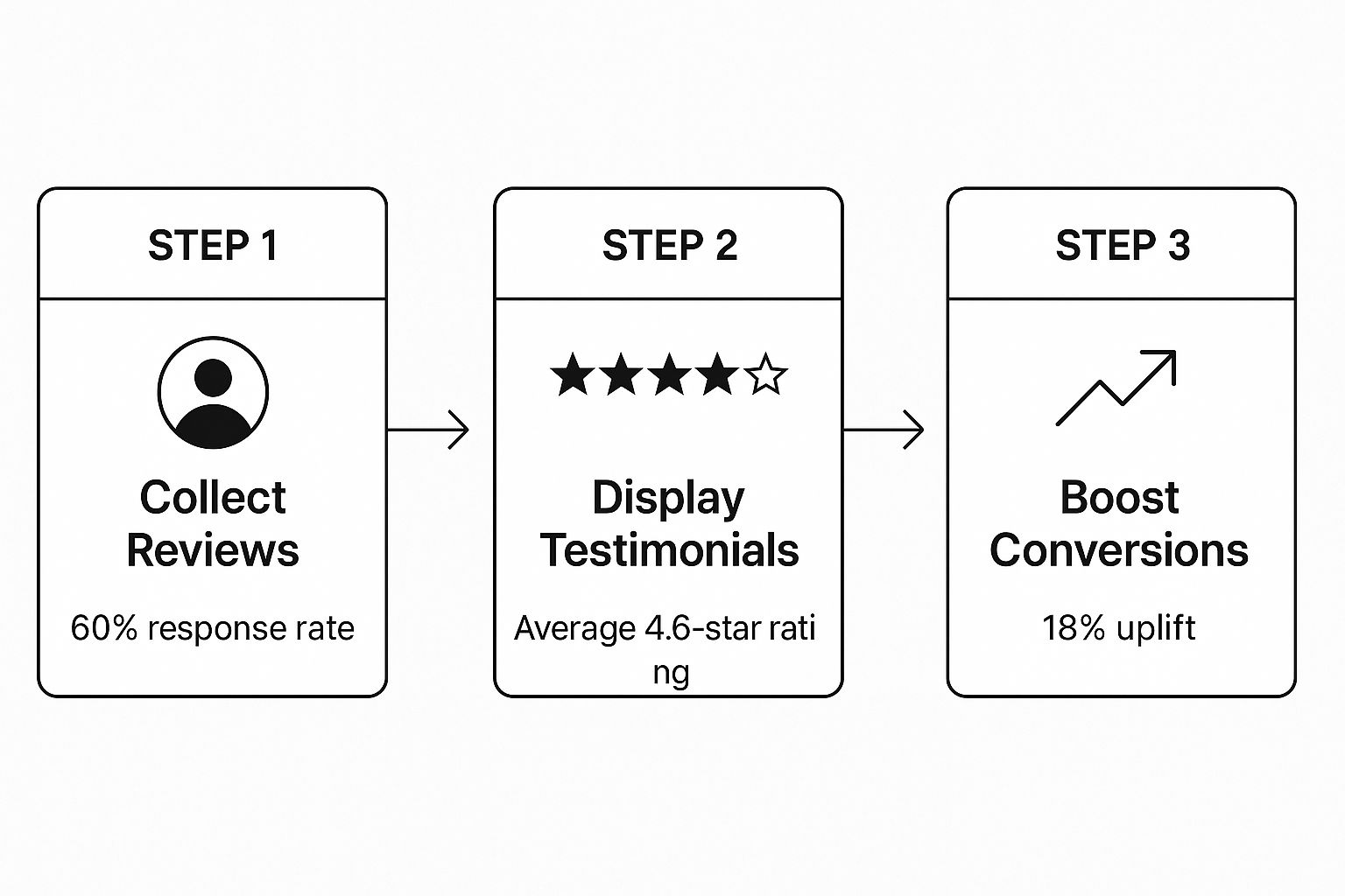
The process of collecting and acting on data creates a powerful feedback loop. For example, gathering and displaying customer reviews isn't just for show; it's a measurable strategy that builds trust and directly boosts sales, as this visual shows.
A Simple Guide to A/B Testing
If personalisation is about what you show your customers, A/B testing is about figuring out the best way to show it. It might sound technical, but the concept is beautifully simple. You show two versions of the same page to different groups of visitors and see which one performs better.
The golden rule of A/B testing is to only test one change at a time. If you change both the headline and the button colour, you'll never know which one truly made the difference.
This disciplined approach allows you to make decisions based on real user behaviour, not just what you think looks better. It’s all about building on small, proven wins.
How to Run Your First A/B Test
Getting started doesn't require a huge budget or a team of data scientists. You can begin with simple but powerful tests.
Here’s the basic flow:
- Form a Hypothesis: Start with a clear idea. For example: "I believe that changing the 'Buy Now' button from blue to green will make it stand out more and increase clicks."
- Choose One Element: This could be anything from a product page headline to the wording on your call-to-action.
- Use a Testing Tool: Tools like Google Optimize (which is free) can help you set up your test and split your traffic between the original version (A) and the new version (B).
- Run the Test: You'll need to let the test run long enough to gather a meaningful amount of data. This could be a few weeks, depending on how much traffic your site gets.
- Analyse the Results: Once the test is done, the tool will show you which version led to more conversions. If your green button got more clicks, you've found a winner. Implement the change and move on to your next idea.
Running a series of small, targeted tests is one of the most reliable ways to improve your website's performance over time. To help you get started, here are some common A/B tests you can run on key pages.
A/B Testing Ideas for Key Ecommerce Pages
| Page Type | Element to Test | Variation A (Control) | Variation B (Test) |
|---|---|---|---|
| Homepage | Main Headline | "Shop Our Latest Collection" | "Find Your Perfect Style This Season" |
| Category Page | Product Layout | Grid view (3 columns) | List view with short descriptions |
| Product Page | Call-to-Action Button | "Add to Cart" | "Buy It Now" |
| Product Page | Product Images | Clean studio shots | Lifestyle images with product in use |
| Checkout | Form Fields | Two-column layout | Single-column layout |
| Checkout | Trust Seals | Displaying security logos | No security logos displayed |
Every test you run, whether it wins or loses, teaches you something valuable about your audience. But keep in mind that slow loading times can frustrate users and completely skew your data. Before you start testing, you need a solid foundation. If you're concerned about your site's performance, our specialised website speed optimisation service can ensure it's running at its absolute best.
By combining the relevance of personalisation with the certainty of A/B testing, you create a powerful cycle of continuous improvement. You stop guessing and start building a website that gets better—and more profitable—with every small, deliberate change you make.
Your Questions on Conversion Rate Optimisation Answered
Getting started with conversion rate optimisation (CRO) can feel a bit overwhelming. It’s a big topic, and it's perfectly normal to wonder where to even begin.
To help clear things up, here are some straightforward answers to the questions we hear most often from business owners. Let's tackle some of the common uncertainties so you can start making changes with confidence.
How Long Does It Take to See Results from CRO?
This is a big one, and the honest answer is: it depends. The time it takes to see a real impact depends on what you’re changing.
Small, targeted fixes can sometimes produce a noticeable lift in just a few weeks. Making your returns policy crystal clear or simplifying a clunky checkout form are classic "quick wins" that can build some early momentum.
Bigger projects, however, are a different story. If you're overhauling your entire site design or rolling out a complex personalisation strategy, you're playing a longer game. For any A/B test to be trustworthy, you need to let it run for at least two to four weeks to gather enough data.
Think of CRO as a continuous process of improvement, not a one-off project. Small, steady gains are what lead to significant, lasting growth over time.
What Is the Single Most Important Area to Focus on First?
Every shop is different, but if we had to pick one starting point that applies to almost everyone, it would be the checkout process. A high cart abandonment rate is a clear signal that you’re losing interested shoppers right at the final step.
Smoothing out the friction here delivers a powerful return on your time. Some of the most effective actions include:
- Offering a guest checkout option. Forcing people to create an account is a known conversion killer.
- Showing all costs upfront. No one likes surprise shipping fees or taxes at the very end.
- Adding popular payment methods like PayPal or Apple Pay to make life easier for your customers.
Once you’ve tackled the checkout, your product pages are usually the next best place to look for improvements.
Do I Need Expensive Tools to Start with A/B Testing?
Absolutely not. While there are some advanced (and expensive) platforms out there, you can get a huge amount of insight using powerful and free tools.
Google Optimize is a fantastic starting point. It's free, integrates directly with your Google Analytics, and lets you run A/B tests and other experiments without spending a penny. Many platforms, including WooCommerce, also have affordable plugins that handle basic testing.
The tool is far less important than your process. The real key is to form a clear hypothesis, test only one thing at a time, collect enough data to be sure, and then act on what you learn. You don't need a big budget to get started.
How Much Does Site Speed Really Impact Conversion Rates?
It has a massive impact. The effect of site speed is direct, measurable, and often underestimated. Countless studies have shown that even a one-second delay in page load time can cause a significant drop in your conversion rate, with some reporting decreases of up to 7%.
Slow-loading pages are frustrating, increase bounce rates, and can make your whole brand feel unprofessional or untrustworthy. This is even more true on mobile, where users expect things to happen instantly.
Making technical improvements like optimising your images, using a high-quality hosting provider, and using browser caching aren't just minor tweaks—they are foundational changes that can give your conversion rate a serious, immediate boost.
Improving your conversion rate is an ongoing journey of listening to your customers and making your site better for them. We hope this guide has given you a clear and helpful roadmap to get started. By focusing on creating a seamless experience, building trust, and making data-driven decisions, you can turn more of your visitors into happy, loyal customers.
Navigating the technical side of CRO can be tricky, but you don't have to do it alone. If you're facing website errors, slow performance, or checkout issues that are hurting your sales, we're here to help. Contact us to learn more.
Meta Description
Looking for how to improve ecommerce conversion rates? Our helpful guide offers clear, practical steps on site speed, checkout, A/B testing, and more to help you grow.